Use Metrics, Not Dashboards
There’s a tendency in tech companies to build dashboards. The process is usually something like this:
- Engineers build systems and collect every bit of data imaginable
- Management hires a data analyst, or maybe just gets a spare engineer
- Analyst goes nuts building dashboards of everything available
The result is a dashboard that has dials, sliders, charts, and random images that ends up looking like NASA’s control center.

Cool right? Also very difficult for an individual to use to solve operational problems.
I want to go over a few things, including
- Why I almost never use dashboards
- Why it’s better to think of just one or two metrics
- Some guidelines for picking the right metric for an ops project.
Why I avoid using dashboards in operations
Complex operations dashboards do this thing where they simultaneously don’t help companies change, and also prevent better metrics or dashboards from happening.
Primarily, dashboards that rely on information systems aren’t designed for operations. They might report on some things relevant to ops (e.g. packages delivered, or transactions completed), but they don’t track the information that isn’t automatically captured.
But here’s how complex dashboards hurt operations:
- Dashboards can make people feel stupid. People pore over them and think “the answer must be in here somewhere”, which is a bit like reading a dictionary in the hope of finding an interesting word.
- Dashboards are the default answer to whenever anyone asks for a metric. “Have you looked at the xyz dashboard?” There’s then resistance to digging up a new metric because so much is in there that’s presumably unexploited.
- Dashboards are so impressive looking that it’s hard to think that a simple number can give more insight that a complicate dashboard.
But in my many projects — in fact, I think in every project — the only use I’ve ever had for a dashboard was to find the function to export data and to combine that with other data needed to make an operational decision.
One reason that dashboards frequently don’t work in tech operations is that operations is the last thing engineers are thinking about. They’re concerned with their domains, which include high-level business metrics, and at a granular level include app or server performance.
But operations deals with physical items for which there may not be automatic data collection. These might be things like inventory, physical process time, or interruptions to workflow (like when we have to suspend outdoor operations due to inclement weather).
The better way to use metrics in operations is always to start with a question. What do you want to grow? Then, what things do you need to measure to ensure that growth will happen?
In every operations consulting project I’ve done, I’ve had to do these things:
- Choose a metric (or two)
- Start measuring it
- Act on the measurements
Some more detail on these steps below.
How to choose a metric (or two)
The goal of choosing a metric (or two) is that it has to be one that you can report that succinctly summarises how the company is going to track towards its operational goals.
The ideal situation is to have one metric that tells you what you have to do. But sometimes it’s not enough and you need two.
For example, at Lyft, a ride-sharing company, at one stage we measured “rides”, which means rides an individual has taken using the app. This includes rides in shared Lyft rides (when we had those) — so if three people were on a Lyft “Line” shared route, it would be three rides.
It seems like a very basic metric, but it captures a lot about the business. Lyft is a marketplace business, always trying to match supply and demand. Measuring rides captures both demand (as it’s a user-centric metric) and supply (as a ride can’t happen unless there’s a vehicle).
You choose a metric based on the growth stage of your business and what you’re trying to achieve.
Another example is our own web business. In the early days, we just measured sessions (an intermediary between users and pageviews). Sessions was important to us because our future advertising partner had a sessions threshold for letting us join as a partner.
They also use sessions because in modern websites that may involve a lot of clicking (e.g. a slideshow), a session has more relevance than a pageview. (Revenue per session is more likely to be constant whether or not your site has a lot of clicking around, as a user will see the same number of ads.)
So we always watched sessions, hoping to grow over the magical ~850/day threshold that would let us join (at the time it was a minimum of 25,000 sessions per month).
But after we started producing revenue — and from multiple streams — sessions wasn’t enough of a metric. No one metric helps us understand operations performance completely, so we opt for two: sessions, and revenue per session. In this way, we know that we both have to grow our traffic, and optimise it for revenue production.
In assessing any operations project, that’s what you do to pick a metric — think about what you’re trying to grow (revenue, users, rides etc.), and then think of the one or two metrics that best summarise how you’re tracking.
Case study — Counting parts
At Wind, a scooter sharing company, we faced a short-term issue of scooter supply. We knew we had ordered over 1000 scooters to Tel Aviv, but for some reason there were less than 300 deployed on the streets.
When I showed up to that scooter warehouse, I saw a ton of spare parts, broken scooters, and unbuilt scooters lying around.
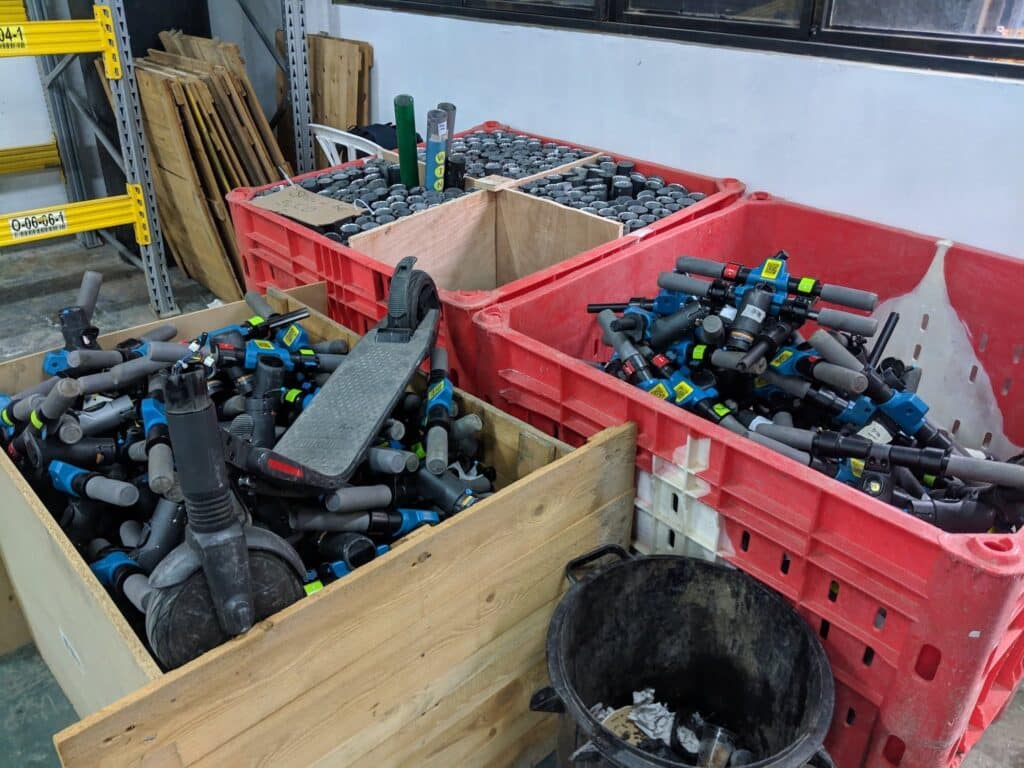
The sophisticated automated analytics could show a lot of stuff, including rides taken and active scooters deployed. But analysts had no way of tracking inventory of scooters that were either broken, in parts, or never constructed.
So I started counting those. I literally counted them by hand, spending days sorting through piles, and made a table.
I quickly realised that every day, there were a number of scooters that were being broken, and a number that were being repaired. Since more were broken than repaired, it became obvious that we had to increase the rate at which we built and repaired scooters.
Then I told staff: here’s where we’re at. “We need to hire people to fix and build scooters. Then every day we’ll count the scooters made, and re-assess how many parts are available. We’ll report on this number daily.”
I started reporting on
- Inventory: Scooters everywhere (in parts, on the street, being repaired, etc.)
- Input and output: Scooters broken and repaired/constructed per day
By looking at these numbers and putting them in a simple chart, it was easy to draw everyone’s attention to the fact that our increased focus on repairing and building was increasing our fleet.
Yes, the top level thing we were targeting was rides. But we knew that we just needed scooters out there and people would ride them. They were thirsty for scooters! Our roadblock was scooters on the roads.
So by targeting scooter production and deployment, we addressed the most important things necessary to get to our top level goals.
Case study of picking a metric — Drone deliveries at Wing
At Wing (an Alphabet company), where we did drone deliveries, there were many metrics used when I arrived. We were aiming for a target of a certain number of deliveries by the end of the year, and we were certainly measuring those.
Everyone knew that to get to those deliveries, we needed more customers and more sites.
But nobody could tell me with certainty how many sites we’d need. “In theory, we can do two deliveries per launch pad per hour,” I was told. This metric would include loading, flight time, and recharge time. “So we need more sites for those launch pads.”
Based on that, there was a scramble to get sites. We were pursuing growth without knowing exactly how many we’d need. One more? Ten? We just went for it.
And beyond this theoretical number, nobody was measuring our pad utilisation. We just knew we had X pads and Y deliveries, and that we needed to do more deliveries.
In our case, daily deliveries = number of pads x hours of day x pad utilisation, which means “deliveries per pad per hour”.
We measured it, and we could see that we were doing more like 1.3 deliveries per pad per hour. This told us two things — a) we were way below the theoretical limit, and b) maybe the theoretical limit was impossible to obtain.
To get to our deliveries target, we thus had three things to do:
- Increase pads (more sites, more pads per site)
- Increase hours of operation (hire more staff, open on more days, consult with regulatory authorities to fly more earlier and later in the day)
- Increase throughput
Increasing throughput turned out to be a fun project. By fixing our ground operations, getting faster chargers, and changing the charge threshold for our drones, we got to the point where we could do closer to the theoretical limit — to the point where we were satisfied that we were reaching the operational limit of around 1.6 for our main test site at peak. This became the benchmark.
The Benefits of Focusing on One Metric
One metric — that’s easy to understand — is easy to communicate around a whole team or company and to get everyone to rally behind it.
Even if you have a complex dashboard that an executive or board likes, good luck getting everyone below them in the organisation to follow.
For example, at Lyft, at some period we focused on the number of individual rides. This was easy to understand and communicate. Every time a team was deciding on whether or not it wanted to do something, we’d ask: “Will that increase rides?”
In fact, we didn’t even have to ask. It became part of the culture.
Another time, at Wing, we focused on deliveries. By focusing single-handedly on that one metric, we were able to ignore a bunch of other things, e.g.: unique customers, revenue, profits per order, etc. The goal was to build up deliveries requested by humans and then fulfilled so we could fine-tune the hardware and software.
The benefit of focusing on one metric is that any time someone piped up with a suggestion that would help another metric, it could easily be argued against. For example, if someone wanted to do some initiative to increase NPS, we’d say: no. Who cares. We literally didn’t care about NPS. I mean, we cared about happy customers, but it came at a second to more deliveries.
(Some customers out there are maybe reading this and sarcastically saying “Well, that explains the long delivery times / failed deliveries”. Yes, it may. But remember, we were selling $1 ice creams with no delivery fees, and had a private chat group with every single customer. It was a very, very early stage product. Thanks for being part of that.)
An important caveat is that the one metric must be easy to understand. At one time, I recall that a clever Head of Analytics came up with an “operating band” system, and there had to be a certain percentage of rides that operated within the algorithmically determined band for each region. It was very hard to understand, communicate, and act upon. After months of educating and answering questions, that metric was killed.
Don’t try to be a genius — Pick one metric, pick wisely, and don’t change it (for a while)
A lot of ex-consultants try to come up with a fancy new framework or metric for each project. It implies a sense of value: “Look, I’m innovating, just for you!”
But this is a trap. Firstly, if you’re a client and your consultant is pitching a really complex new framework or metric, then it’s probably a chimera.
Secondly, if you think your company is a special snowflake and not quite like any other, you’re wrong. In the many decades since the industrial revolution, many companies, business units, and individuals have used a plethora of metrics to measure growth. If you’re doing something, someone probably has done it before. And if there’s a company out there that’s like yours and has grown a lot, then it makes sense to use the same metrics they use.
Of course, those might not be obvious, if your industry is a fairly new one. It’s just that if it’s an established one, like an airline, then you can use an established metric, like aircraft-seat-kilometers.
Thirdly, a complex metric means senior managers may do silly things to game the system, particularly if there is a bonus system (or even just glory) involved.
Finally, complex metrics are really hard to sell. Even if you can convince top level managers that they’re important, they’ll struggle to sell the idea down the levels of staff. I’ve seen many fancy metrics come and go. Don’t waste your time!
Also, bear in mind that there’s organisational fatigue every time a metric changes. At the top level of a company, changing more than once a year is a bad idea. I’d even advocate for changing less often than that. I remember at Lyft we changed tack twice in one year in ops and there was pandemonium. I can’t quite remember what they were, but I just remember a lot of sarcastic distrust of the analysts that came up with the metrics.
Choose well and choose carefully.
