How to Add Stacked Bar Totals in Google Sheets and Excel (an easier way)
A problem I faced early in Google Sheets or Excel was how to create stacked bar totals — how to just see the total value of all items in a stacked bar chart.
The totals of a stacked bar should show the total of all the values in a bar. This lets us make a chart that shows
- The total value of something, e.g. of money or of website traffic
- An understanding of the rough proportion of contributing factors
Like this: (I added dotted lines around the bits I’m trying to highlight)

I could also make this as a 100% stacked bar, but it depends on the message (total value vs proportions of components).
So how do you do this? Neither Google Sheets nor Microsoft Excel have this natively. (My example below is using Google Sheets, but exactly the same principles apply in Excel.)
Back at a consulting firm, I used to use this elaborate plugin for Microsoft Excel, but I think that’s overkill.
Of course, that means I was limited to certain old versions of Excel that the plugin supported.
So here’s how you make these stacked bar totals in Google Sheets or Excel natively.
You might be looking for how to make totals for 100% stacked bars — I’ve made a separate post on that here. (It ain’t pretty…)
Stacked Column Chart Totals in Google Sheets/Excel — In a nutshell
In a nutshell, here’s how you make stacked bar totals.
Note — I updated this method to an easier way!
- Add another series for the total (calculated), making sure it is displayed in the chart
- Change the chart type to
- Show data labels, and align them so they’re at the bottom of the bar.
- Change the colour of the bar to transparent.
- Adjust the axis
More details — step-by-step stacked bar totals
You can access a workbook with this chart in it here.
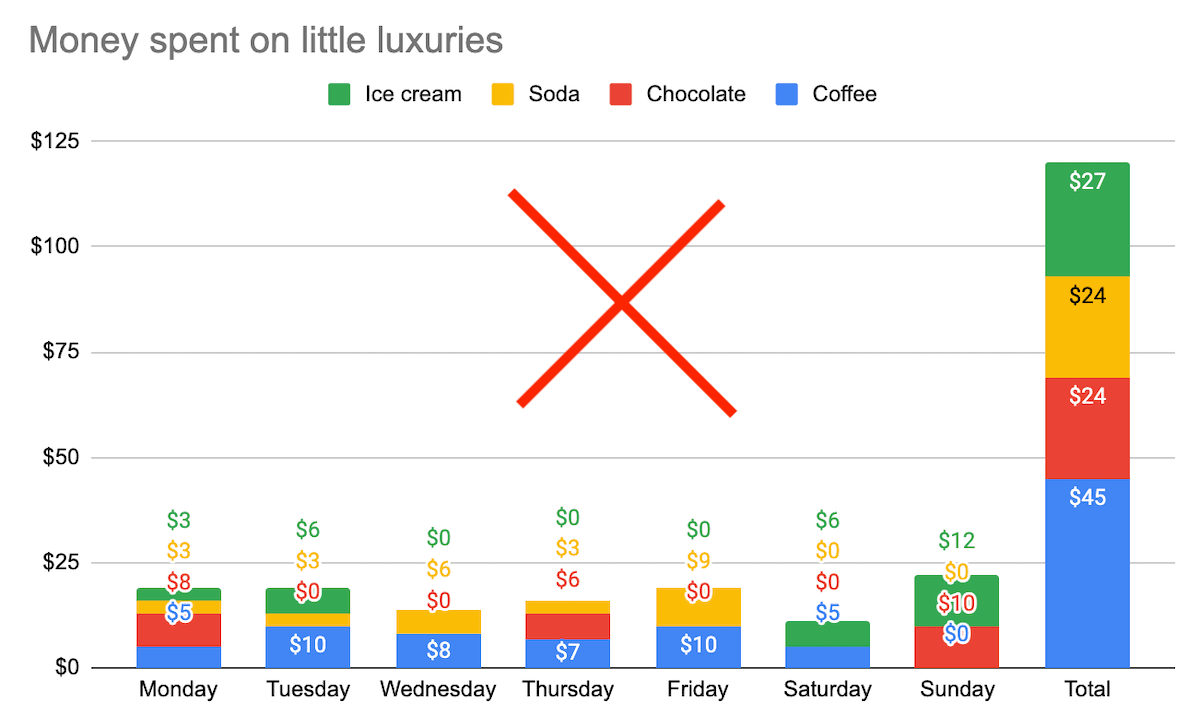
Here’s the starting Google Sheets chart. What are the totals?

Some common ways I see people frustratedly working around this are to add either a) values for every single cell, and/or b) a total column.
These are ugly and take away from the legibility of the chart. Suddenly it doesn’t show any particular story. A screenshot of the table of data would have been more useful.
Here’s the dataset I used.
I added a “Total” column at the end. I’m going to use this as the series for the total values.

Next I add it to the chart, and show the value at the bottom of the bar. It’s a big ugly column (which isn’t how I’ll leave it).

I first change the chart time to a combo type, with columns set to “stacking”.
And I make sure that the data I want to stack is in column format, and that the total is a line.
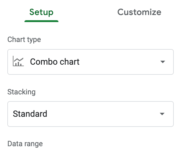
Change to a “combo” chart, with standard stacking 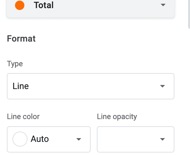
Format the total to be a “line”. The other series are “columns”
I set the colour of the total line to transparent. In Google Sheets it’s more practical to do this by setting the fill opacity.
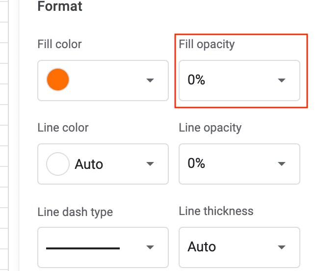
But when you change the opacity, you have to manually set the colour of the labels.
And you’re done! (Well, formatting aside… I always increase the font sizes.)
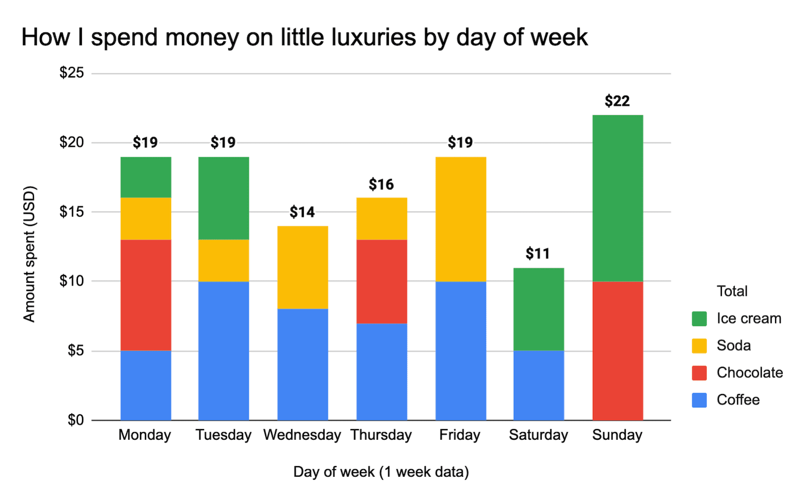
Downsides to this method of showing stacked column chart totals
Obviously, this method isn’t perfect or easy (or you’d have found it already).
The main two downsides are
- It’s a bit clunky — not a simple button you can click when making a chart
- The legend always shows a “total”
The improvement of this method over the previous is that you never have to adjust the axes.
For these reasons, I’d think of this technique as being at the presentation stage. You have your data and you want to present it, so you want to make a chart.
If you’re building a dynamic dashboard, it’s only useful if your data all stays within a certain operating range.



Thanks! This post was very informative. Boggles my mind why this isn’t a built-in feature.
Me too. There are a few weird long-standing gaps!