How to Make a 100% Stacked Bar with Totals in Google Sheets and Slides
I don’t like pie charts (other than fun names for them in other languages), but I do like 100% stacked bars. You can put a few next to each other and expound upon parts of them. Together, they tell much more of a story.
Back in The Firm (no, not that one… one of the pretenders to the crown) we had a tool that let us make 100% stacked bars with totals and names on each section. Sadly, I don’t have access to that any more — nor will I pay for some third-party tool — so I have to make do with this clumsy solution in Google Sheets.
Note — this isn’t a perfect solution. But you can make do with a couple of adjustments, particularly if you’re pasting it into Google Slides.

100% Stacked Bar with Totals in Google Sheets — Methodology
In a nutshell, here’s what I do.
- Add a “Total” block that’s the sum of each column. This doubles the size of the column.
- Change it to clear (100% transparency) with no border.
- Set the axis to 50% and hide it.
- Put the total in the bottom of the bar
Then, for some extra flair, I manually change the number format for every field I want to show to something like
"This is the number: "0.0Example and Detailed Steps
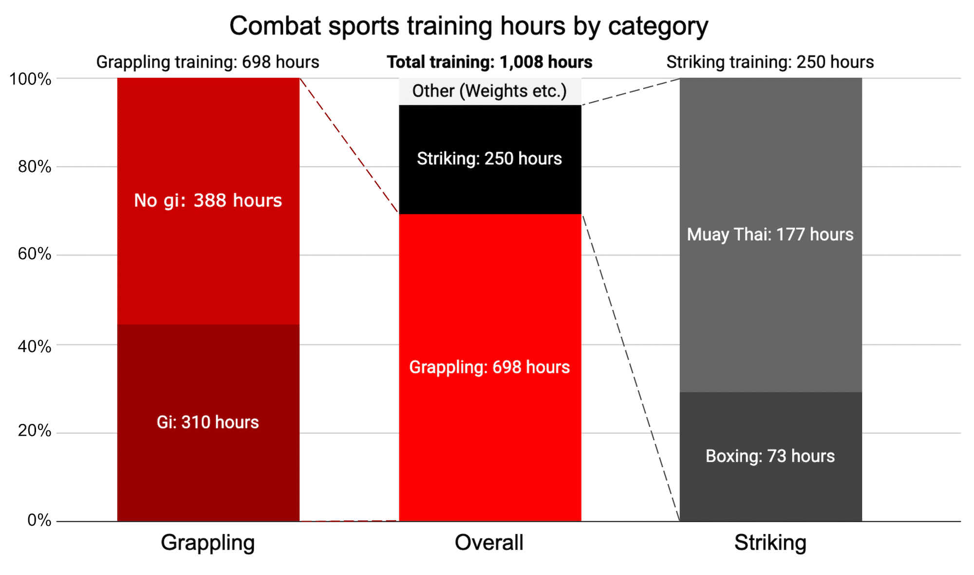
For example, here’s data from my current training log for combat sports (I recently hit 1000 hours and wanted to make a graphic of the breakdown — that’s how I got to this point).
Create your data set
Here’s the data that went into the chart.
| Category | Grappling | Overall | Striking |
|---|---|---|---|
| Gi (inc. Judo) | 309.75 | ||
| No-Gi/Wrestling | 388 | ||
| Total Grappling | 698 | ||
| Grappling | 698 | ||
| Striking | 249.5 | ||
| Other | 60 | ||
| Total Overall | 1007.5 | ||
| Boxing | 72.75 | ||
| Kickboxing | 176.75 | ||
| Total Striking | 249.5 |
Note a few things I did in setting up the data.
- The total bar is in the centre. This is so you can reference “chunks” of it to the left and right.
- Each column has its own total (so the value is shown at the top of the bar)
- Some of the data is repeated — again, this is just so it’s represented in the middle bar as well as in the totals of the other bars.
Create a chart based on the data.
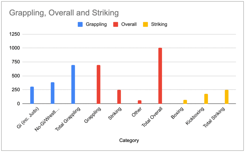
My god that looks bad! Let’s clean it up
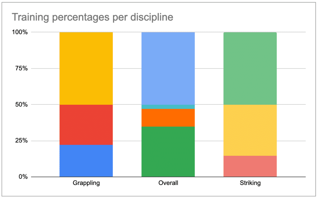
- Choose the 100% stacked column format.
- Click on “Switch rows and columns.”
- Do other clean-up – remove the useless bottom axis description and give it a better title.


Here’s where we are so far.
Create the Total
Now, we have to get rid of that ugly top part (everything above 50%). I’ll do this by changing them to transparent, and then setting the axis to 50%, and set a total.
For each data point (i.e. square in the above — the big ones above the 50% line), do the following. Double-click on them to edit them individually.
First, set the transparency for each of them to 50%.

Second, add in a data label for the element and choose for it to be at the bottom (“inside base”).
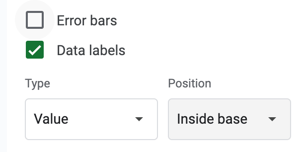
Then set the axis maximum value to 50% (which is “0.5”).

Here’s where we’re at so far. Getting closer!
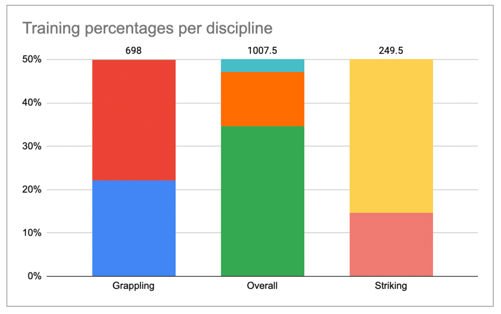
After this, most people would be content with removing the axis — which you can’t do, by the way, you just have to set the font colour to white.
Polish the 100% Stacked Bar Chart
There are two things I’d do to polish this and make this presentation-ready.
- Add in some labels, because there’s no legend
- Add back that axis (but not in Sheets)..
First, add labels. You can do this in Google Slides, but then every time the data changes (if it does), the labels would move. That’s a bit ugly.
Procedurally ugly but visually and technically more appealing is to create a custom label for every segment. This sucks but as it involves a lot of clicking, but frankly, there’s no better way.
For each segment, you have to format the number and choose a custom number format.
Because this kind of sucks, you may at this point a) get an intern to do it (suckers! unless you are the one, as I once was, or am now, for myself) or b) go buy a $100 software package, expensing it to your boss’ lunch account. Will they notice? Yes, but that’s a later you problem.
But if you’re mired in this abyss of editing, you can at least be tricky and add a number value next to the text label.
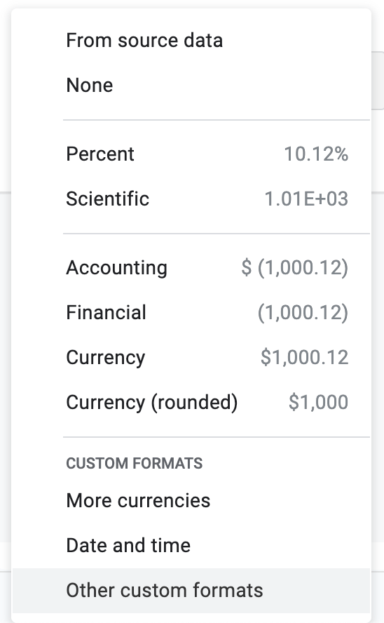
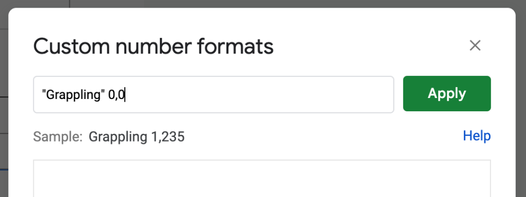
Now, copy your chart, paste it into slides, and the scale on the left, aligning properly as has been beaten into you. And you’re done!

I also drew in those dotted lines. Yes, they’ll move. But whatever; I needed them.
Wrap Up
This is as clean as I could do it in Google tools that are free. I know it’s not perfect. I’ve been waiting a decade for Google to add features like these, but I’ve given up (they’ve since added and removed countless other apps and features I’ve ignored). If you have any suggestions for how to do it better, I’m all ears. Please help!
And if you’ve read this far, here’s a fun fact: In French, a pie chart is called a “camembert”. I’m not kidding. I first heard it when a friend was talking to me about some statistic, and he casually said in French “If you take a camembert…” (“Si tu prends un camembert…”). I nearly died inside as I figured out what he meant. There are a few other fun words for a pie chart in other languages!

